Tactile Metaphors
OVERVIEW:
Skeuomorphism is a design principle in which elements in a new medium are made to resemble their counterparts in a previous or physical medium. In the context of User Interface (UI) design, this means digital interface objects are rendered to look and behave like their real-world, three-dimensional counterparts.
The primary goal of skeuomorphism is to reduce the cognitive load on the user by leveraging familiar visual metaphors. When digital technology was new, skeuomorphism served as a necessary bridge, helping users understand abstract functions by making them tangible.
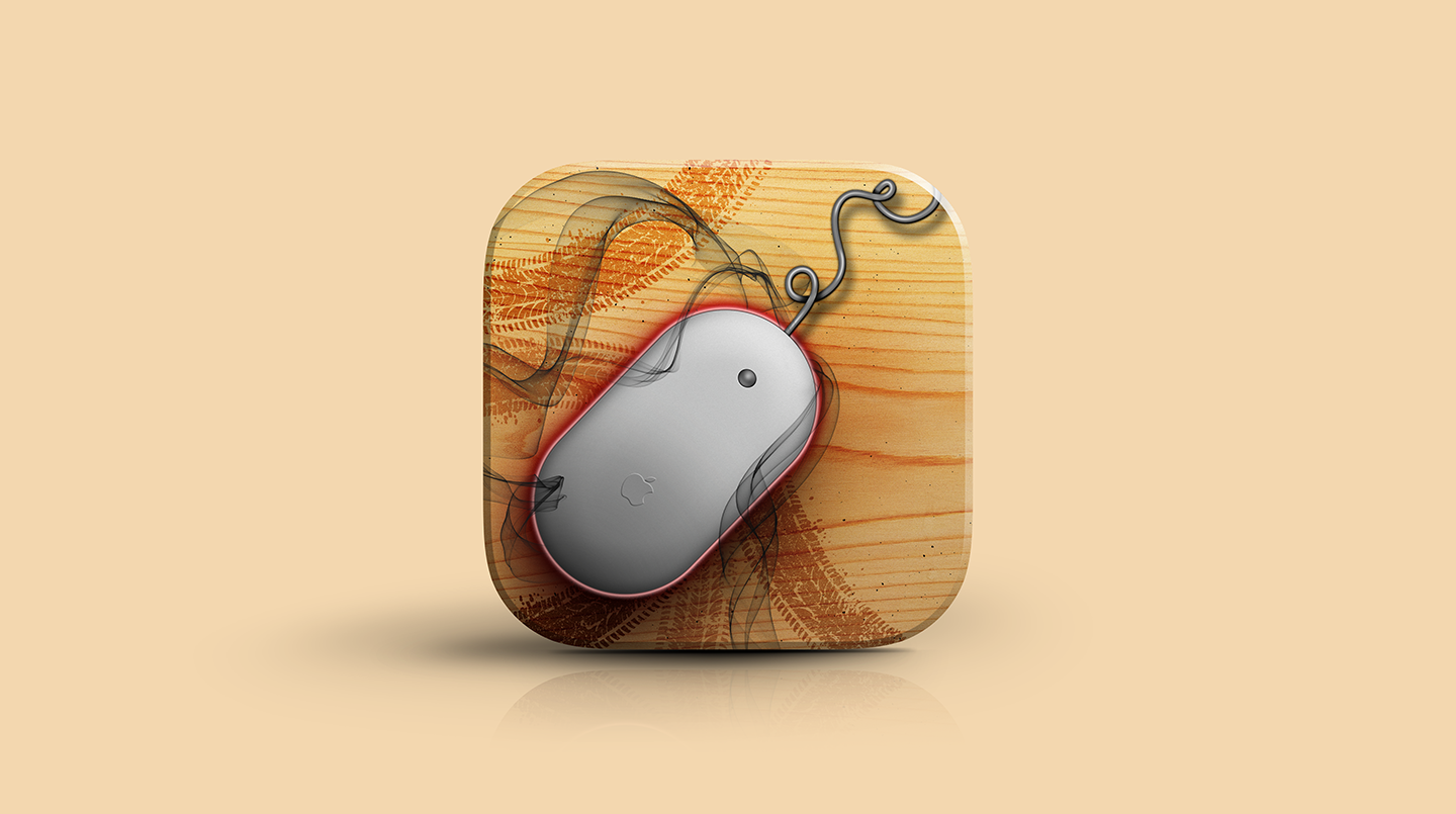
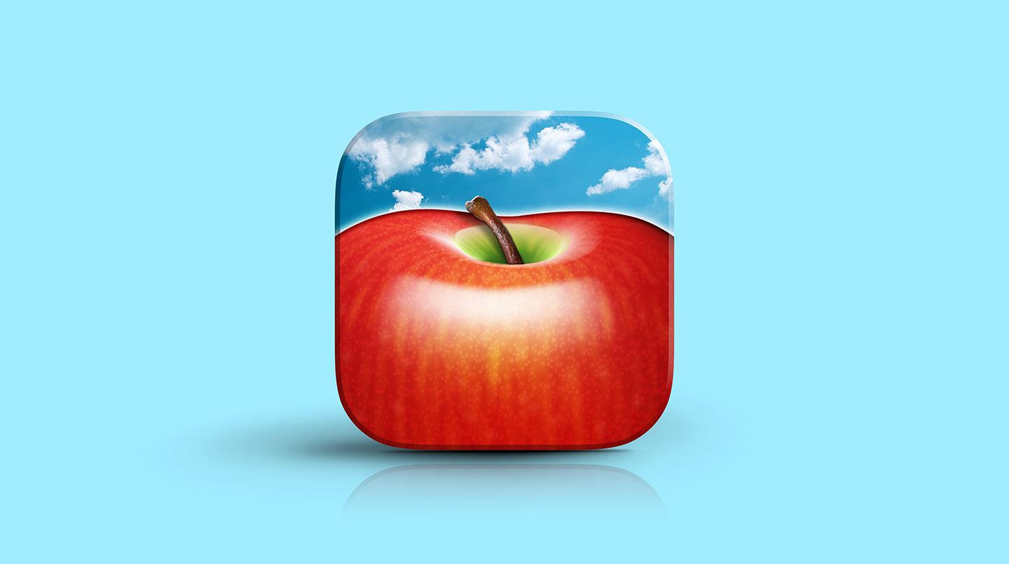
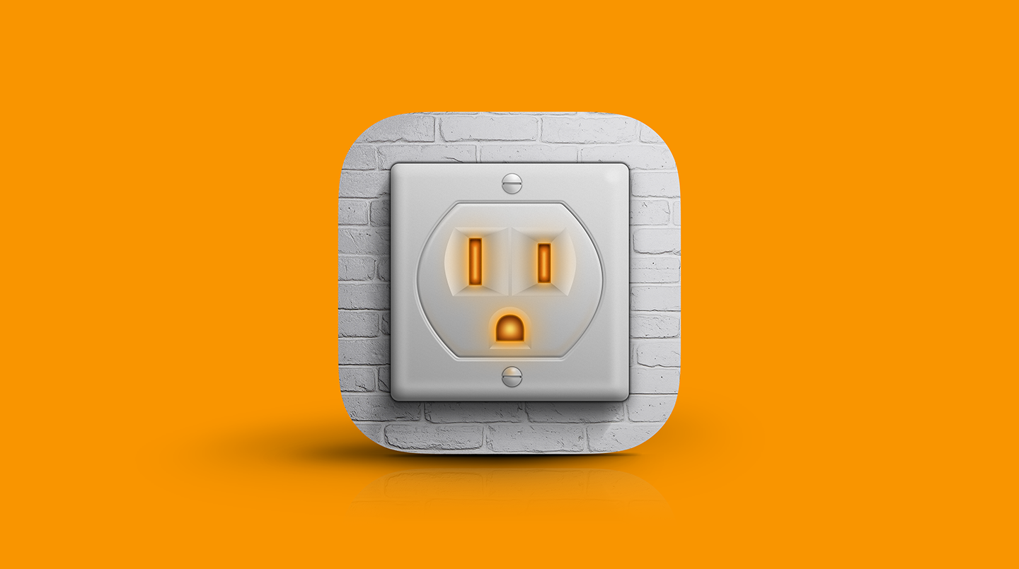
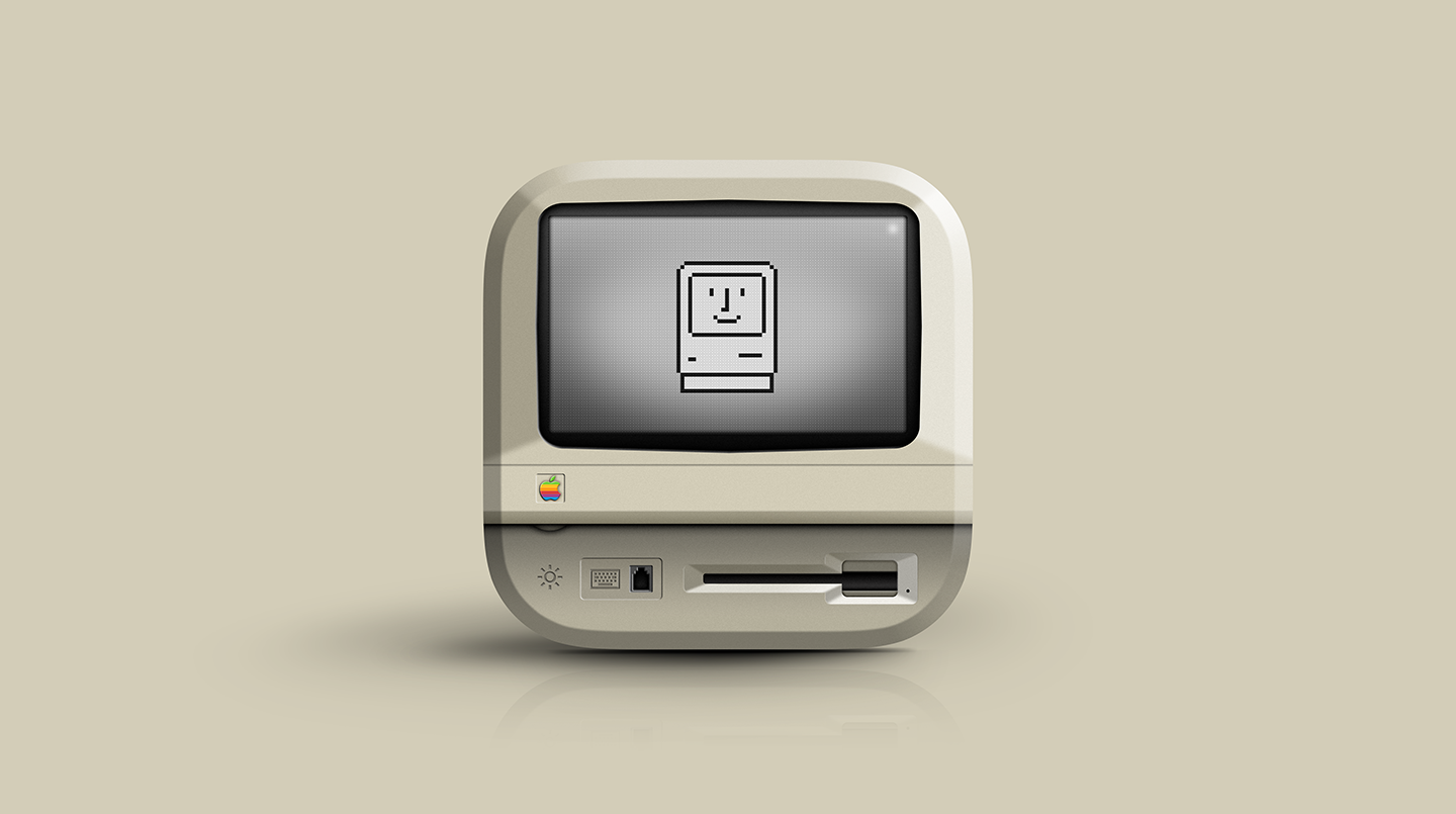
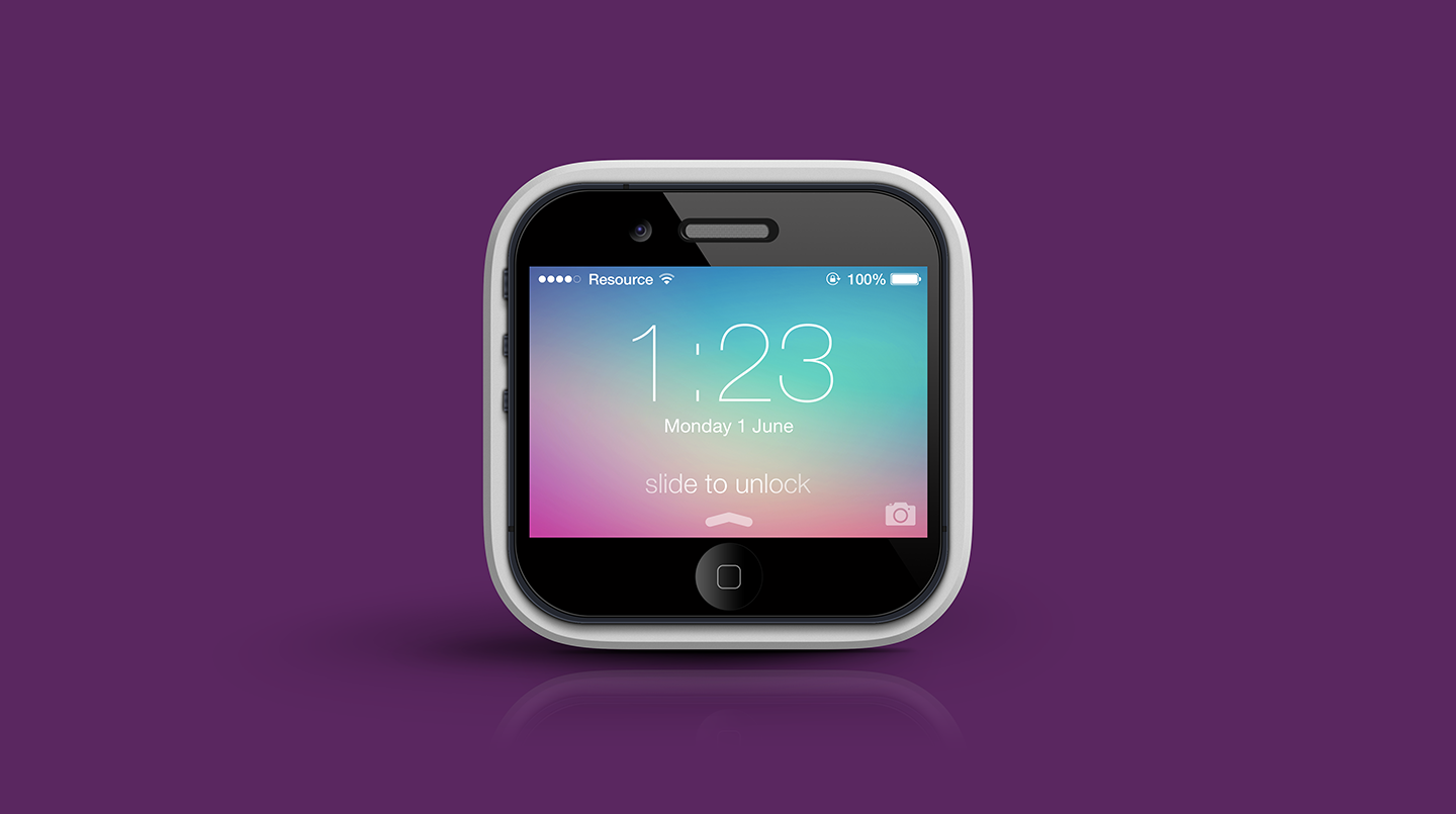
Skeuomorphism reached its cultural peak in the late 2000s and early 2010s, most notably under the direction of Steve Jobs at Apple, where it was heavily used in early versions of the iPhone and iPad operating systems (iOS 1 through iOS 6). Apps like the iBookshelf, the stitched leather calendar app, and the virtual wood-paneled GarageBand controls defined this era.
The style began its decline around 2013 with the introduction of Flat Design (and later Material Design), which prioritized efficiency, speed, and clean typography over visual realism. Critics argued that skeuomorphism was visually distracting, unnecessarily ornate, and did not scale well across different screen sizes. However, its fundamental principle—using recognizable icons to map digital function to real-world experience—remains a core tenet of good design today.
ROLES:
Art Direction
Visual Design
CHALLENGE:
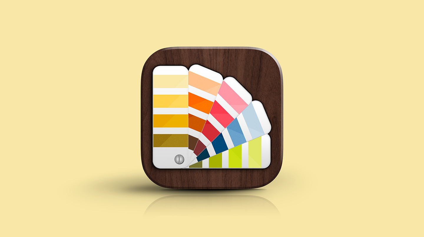
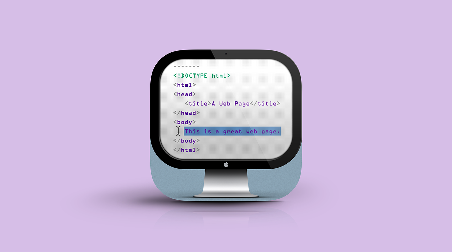
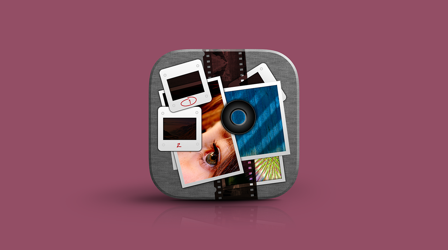
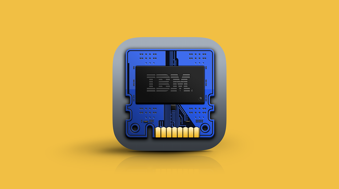
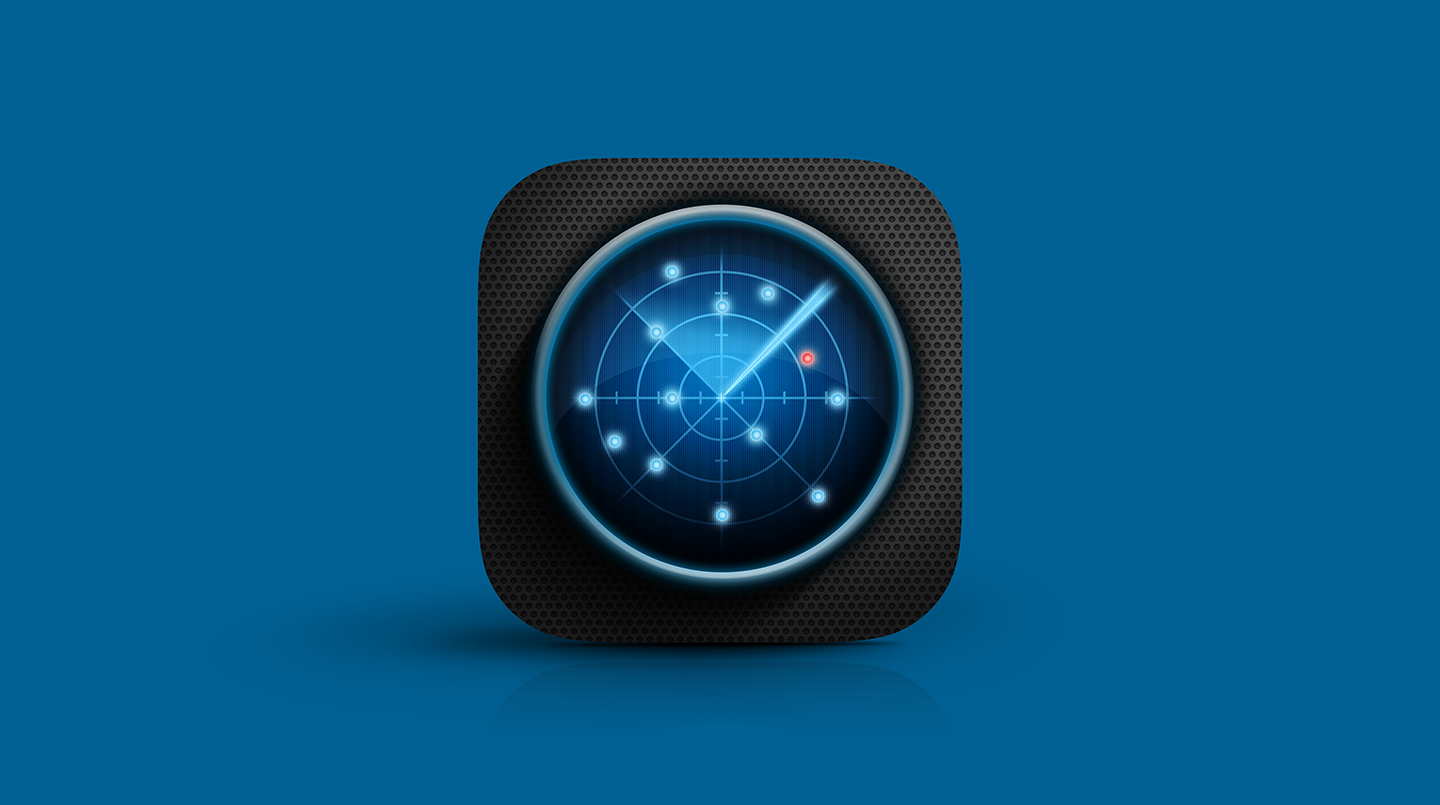
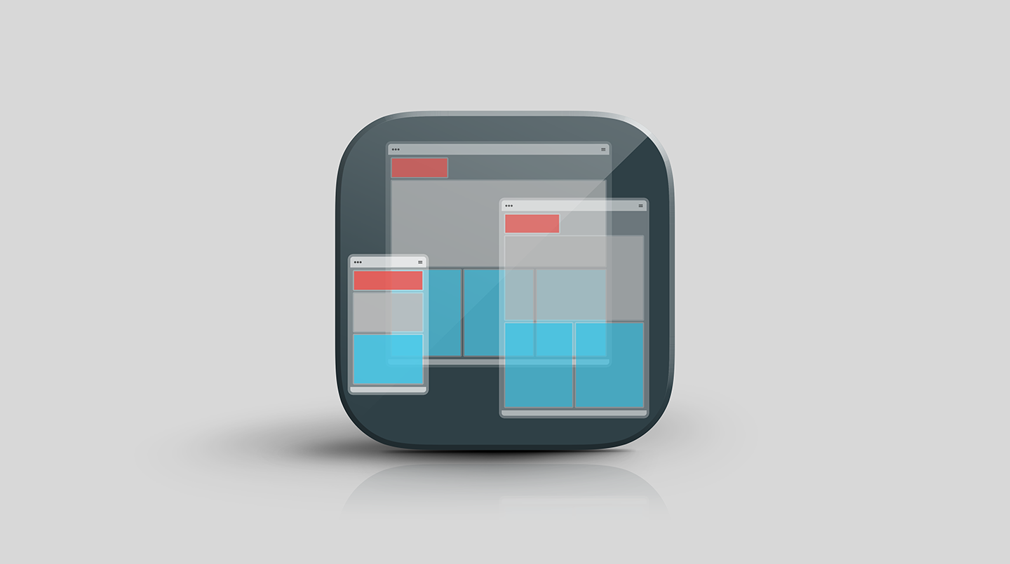
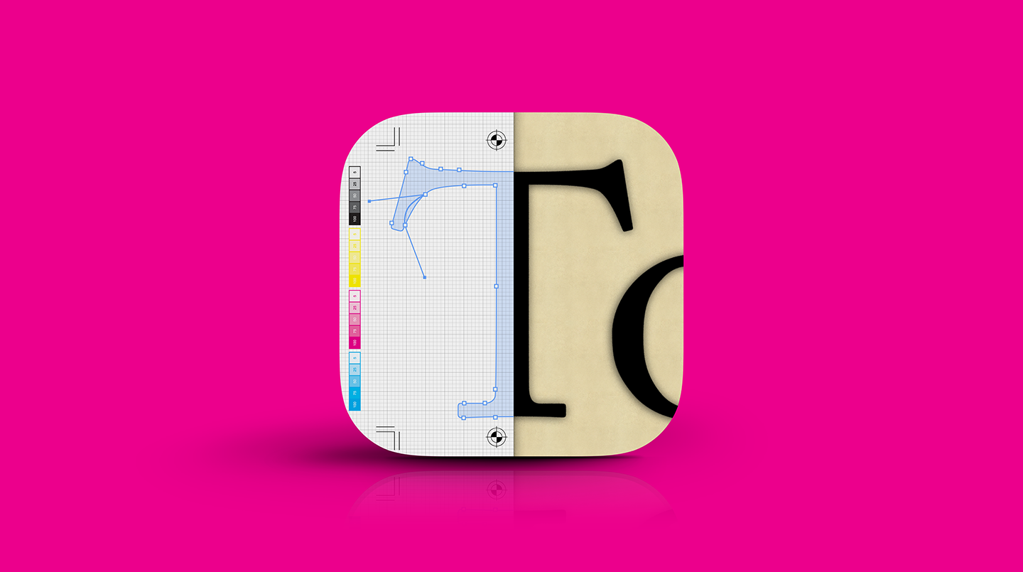
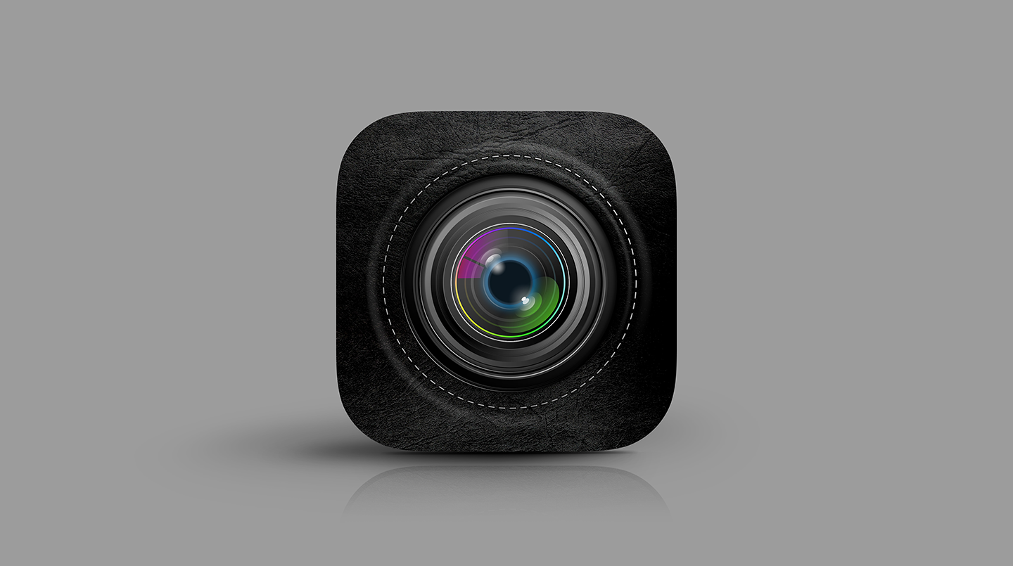
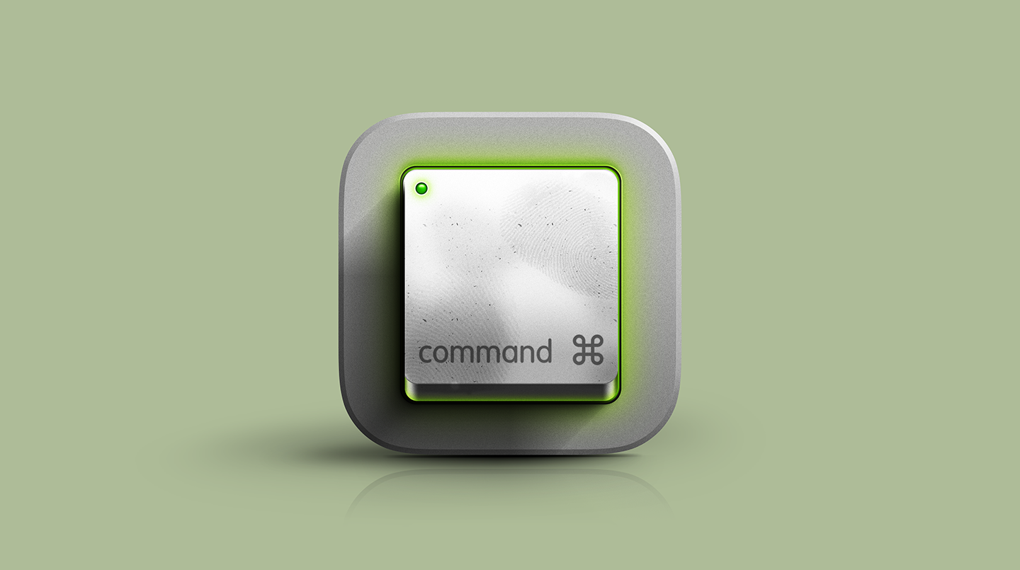
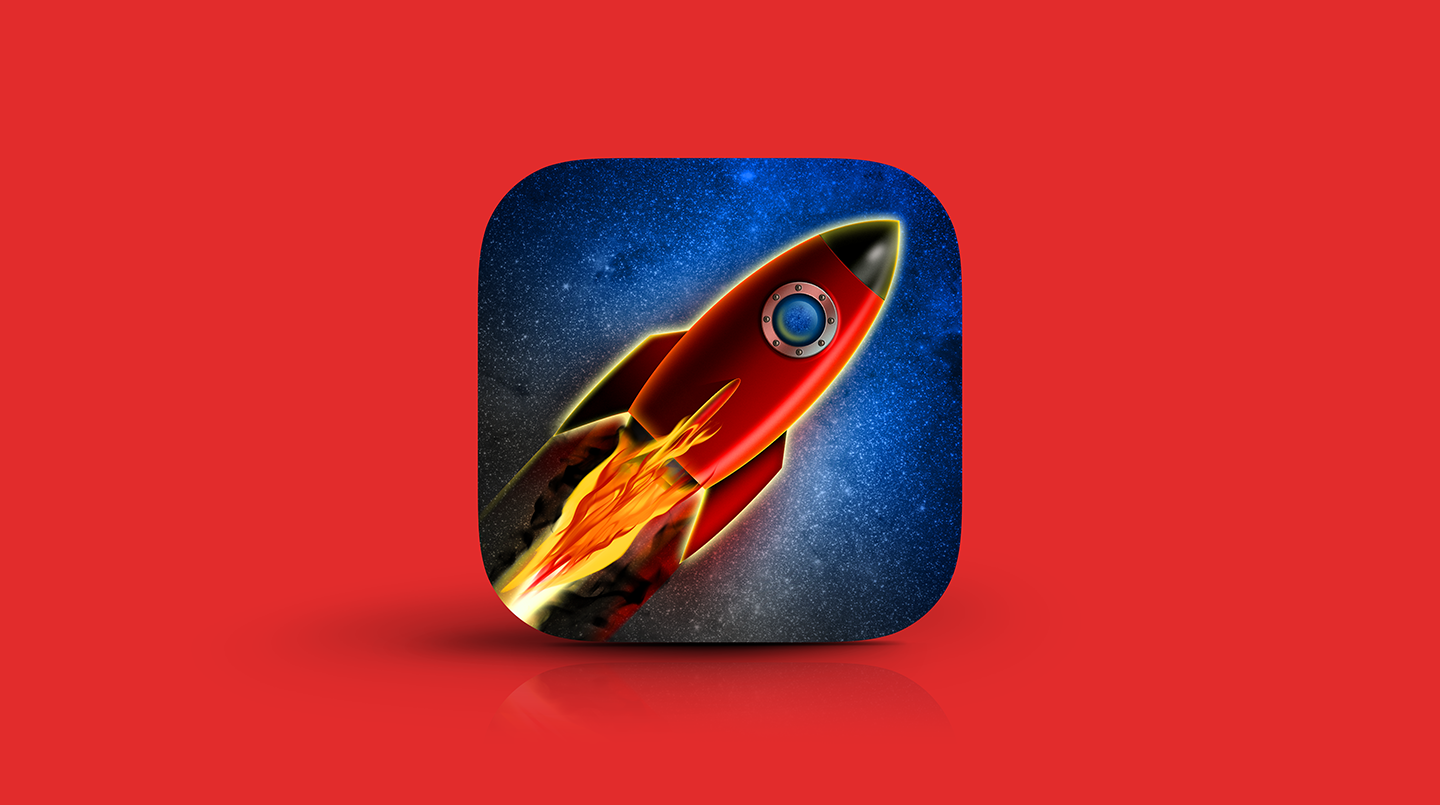
Without entirely abandoning the skeuomorphic approach, a series of ownable, high-impact icons were requested for our creative digital studio.
These icons, would retain a realistic, dimensional style, serve as a companion brand voice—unique enough to connect to our brand personality. Whether used statically or dynamically, they would be leveraged across all core, front-facing digital and marketing assignments, including the website, email marketing, social media, and video. Their unique depth and flexibility allow us to clearly and memorably define processes, capabilities, and strategic objectives.
Leveraging the Google Material Design footprint, this system will blend geometric structure with skeuomorphic, tactile metaphors.
It should move away from the standard of reductive simplicity, favoring additive details to create realistic, instantly recognizable icons. Despite this added detail, adherence to the strict a keyline grid (and shapes) ensures consistent proportions and balance on any screen size.